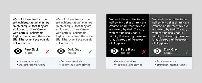
Why using pure black text or backgrounds strain eyes?
👁️ Ever wondered why your eyes feel strained when reading text in pure black on a bright white background? Let’s dive into it!

Using pure black text on a white background can strain the eyes due to a phenomenon called “Luminance Contrast.”
🌟 “Luminance Contrast”: Luminance refers to the amount of light that a surface emits or reflects. When you have a very high contrast between the text (which is very dark) and the background (which is very light), the difference in luminance levels can be intense.
🔍 Here’s why this can lead to eye strain:
- Pupil Dilation: When you’re exposed to bright light (in this case, the white background), your pupils constrict to reduce the amount of light entering your eyes. Conversely, in low-light conditions, your pupils dilate to allow more light in. When you have extremely bright and dark areas in close proximity, like pure black text on a white background, your pupils need to constantly adjust, which can be tiring for your eyes.
- Eye Fatigue: The high contrast can cause your eyes to work harder to focus and process the information. This can lead to eye fatigue, especially when reading for extended periods.
- Glare and Reflections: The high contrast can create glare and reflections on the screen, which can be uncomfortable for the eyes.
- Adaptation Time: When you transition from looking at pure black to a bright white background (or vice versa), there’s an adaptation period during which your eyes need to adjust to the new level of luminance. This constant adaptation can strain your eyes.
💡 An analogy: Think of switching on a bright light in a dark room — it’s harsh on your eyes. But a gentle, dim light is easier on your eyes.
🖌️ Designers often choose slightly softer colors to reduce the strain and improve readability. It’s all about making your reading experience more comfortable!
#EverWonderedWhy07 #EyeHealth #VisualComfort #UserExperience #ColorContrast #DesignPrinciples #DigitalDesign #UXDesign
